
DawnPulse
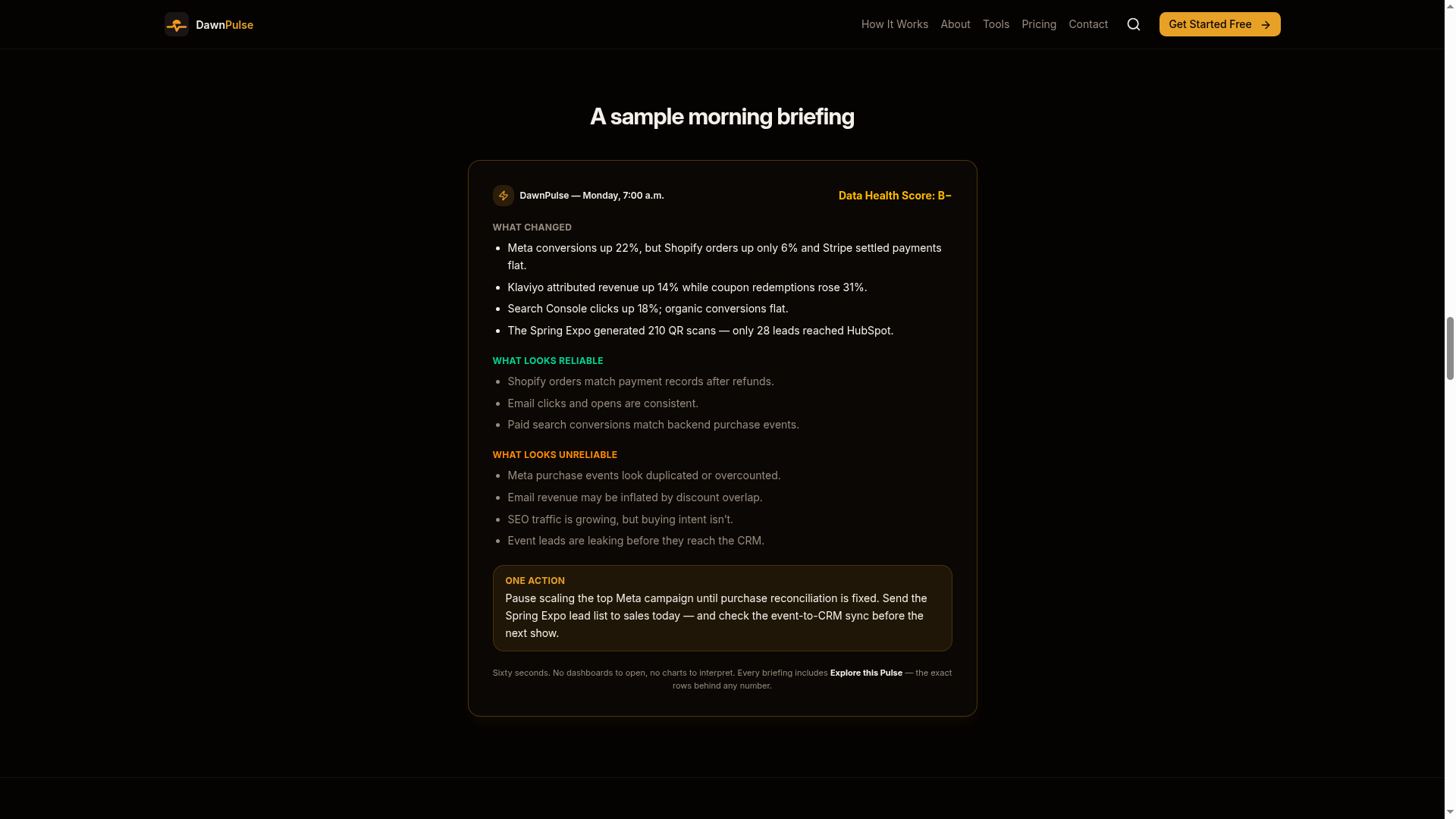
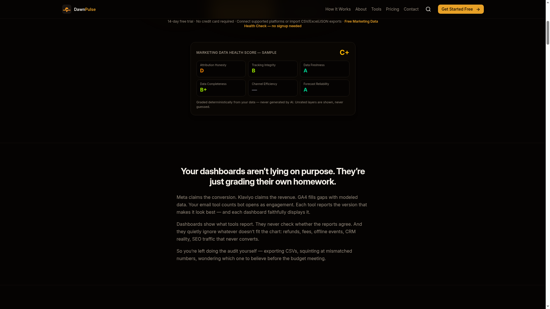
DawnPulse is the independent audit layer for marketing data. Every night it cross-checks ads, email, SEO, analytics, commerce, payments, CRM and offline events against each other, grades data reliability A–F with a Data Health Score, and sends one plain-English briefing each morning — what changed, what you can trust, and the one thing to do next. The studio designed the brand, the marketing website and the end-to-end product experience.
One of two products designed end to end for the same client — the other is Framework First.
- Role
- Lead Product & UX Designer
- Year
- 2025 — Ongoing
- Scope
- Brand Identity, UX Strategy, Website Design, Product UX
- Live
- Visit site ↗
Context
The independent audit layer for marketing data.
Deliverables: Brand system, UX research, Marketing site, Product flows, Design system.
Problem
Marketing operators drown in dashboards they never asked for. The insight exists in their data, but it is buried behind configuration, filters and chart-junk. DawnPulse needed a brand and product experience that felt like the antithesis of enterprise BI: calm, opinionated and readable in sixty seconds. The design challenge: make an analytics product that people with no analytics background trust at first glance.
Process
Audited incumbent analytics tools and interviewed operators to validate the core pain: insight exists, attention does not. The briefing format was validated against real morning routines.
Mapped the critical events (connect a source, receive first briefing, act on an insight) and defined the jobs-to-be-done for founders, operators and marketing leads separately.
Explored low-fidelity concepts for the briefing layout, ingestion flows and site narrative. Tested density vs. readability trade-offs until the 60-second read held up on mobile.
High-fidelity prototypes reviewed with the founding team and pilot users. Metric cards, forecasting language and empty states were refined until first-time readers parsed them unaided.
Shipped brand guidelines, the marketing site, product UI mockups and a component library, documented so the team extends the system without design debt.
Key decisions
Narrative-first UX
The entire experience is built around one artifact, the morning briefing. Every screen either delivers it or sets it up. That constraint shaped the information architecture of both the site and the product.
Brand as proof of concept
The dawn-inspired identity (dark canvas, warm amber signal, generous type) demonstrates the product promise before a single feature is explained: complex data, delivered calmly.
Zero-configuration onboarding
Connect by API, forward an email, or upload a CSV. Three paths, one outcome, designed so the first briefing arrives before motivation fades.
Product
What was delivered
60s
Read-time design target
03
Zero-config ingestion paths
01
Paragraph as the whole interface
These are delivery facts — what the design contains, not business results. The products are live and in use; measurable outcomes will be reported here when the client shares them. What was validated with real users during the process is documented above.
Working on something similar?
Tell me what you're building and where it's stuck. You'll get an honest read on whether I can help — and what working together would look like.